Information architecture redesign
Center for Humane Tech
Center for Humane Technology aims to spread awareness about persuasive technology and mobilise professionals to combat its insidious effects. However, their website's poor IA interferes with this objective.
The solution
Redesigning the website's information architecture based on user research and established heuristics will enable users to prioritise learning and taking action.
Context
This project was done as part of a course project and is in no formal way associated with the Center for Humane Technology.
Our team of 5 worked on this project from September 2021 - December 2021
Our team of 5 worked on this project from September 2021 - December 2021
my contributions
Analyse data from usability studies
Utilize card sorting results to design new IA and preliminary sketches
Conduct tree testing to validate and refine IA changes
The process

Identifying Context
CHT's (Center for Humane Technology) mission is to drive a comprehensive shift toward humane technology that supports our well-being, democracy, and shared information environment.
This project was driven by their mission to provide easier access to the information regarding humane technology and a clearer pathway to the call to action that drives that change.
View Original Website
Identifying Content
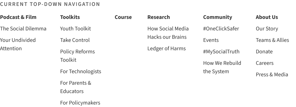
TOP-DOWN NAVIGATION
6 major category links with secondary navigation links in the hover drop-downs. Interestingly, the website also provided a hamburger menu with slightly different categorizations for the same information as the main navigation.
BOTTOM-UP NAVIGATION
Some inner pages inconsistently provided links to other pages that CHT thought were related by content.
LABELS
There is inconsistent use of language throughout the website. Links and corresponding target pages are labelled differently even across the website. The labels are often ambiguous, non-descriptive and hard to differentiate.
EXTERNAL LINKS
There is a lack of consistency within the domains and format of pages. While some links opened up pdf files, others led to separate domains that were still part of CHT. Additionally, the website was largely inconsistent yet liberal with opening links in new tabs.
SIGNIFIERS
The website uses inconsistent and confusing formatting for the text including links and emphasis. We found it very difficult to distinguish the clickable text. There were also instances where most links were images with no indications in the accompanying text.
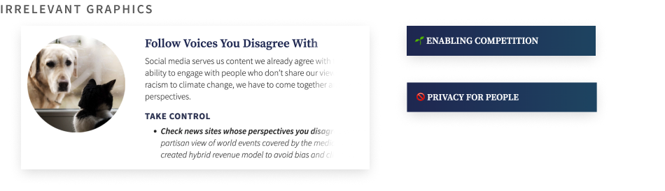
IMAGES AND GRAPHICS
Images are frequently used throughout the website to support the content, however, there were instances where the images lacked a clear relationship with the content.
Identifying Users
Educators, Technologists, and Policymakers are the primary intended audience for the CHT website, as is evident from the navigation categorizations in the main nav.
TECHNOLOGISTS
The CHT’s page for technologists focuses on how changes can be made to technologies from within the industry. They want to shift the standard practices and thought processes of the people who are building and designing social-oriented technologies.
EDUCATORS
The goal of the page “For Parents & Educators” is to gain enough information to be able to help young people navigate their way through the social internet. The CHT wants to give trusted adults a way to start conversations with the younger people in their lives.
POLICYMAKERS
In targeting policymakers, the CHT hopes to influence the actions that legislative bodies take and the types of policies that they create.
Usability Testing + Interviews
PARTICIPANTS
3 representative users - Technologist, Educator, Policymaker
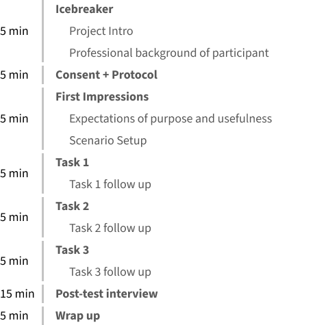
USABILITY TESTING - THINK ALOUD
Participants were given a scenario relevant to their field to put their respective tasks into context. Each task was followed by a brief question to gather the participant’s general impression.
SEMI-STRUCTURED INTERVIEWS
The participants were asked about their positive and negative impressions of the website and the organization of the sections they explored. We aimed to understand the participant’s unique perspectives towards the website.
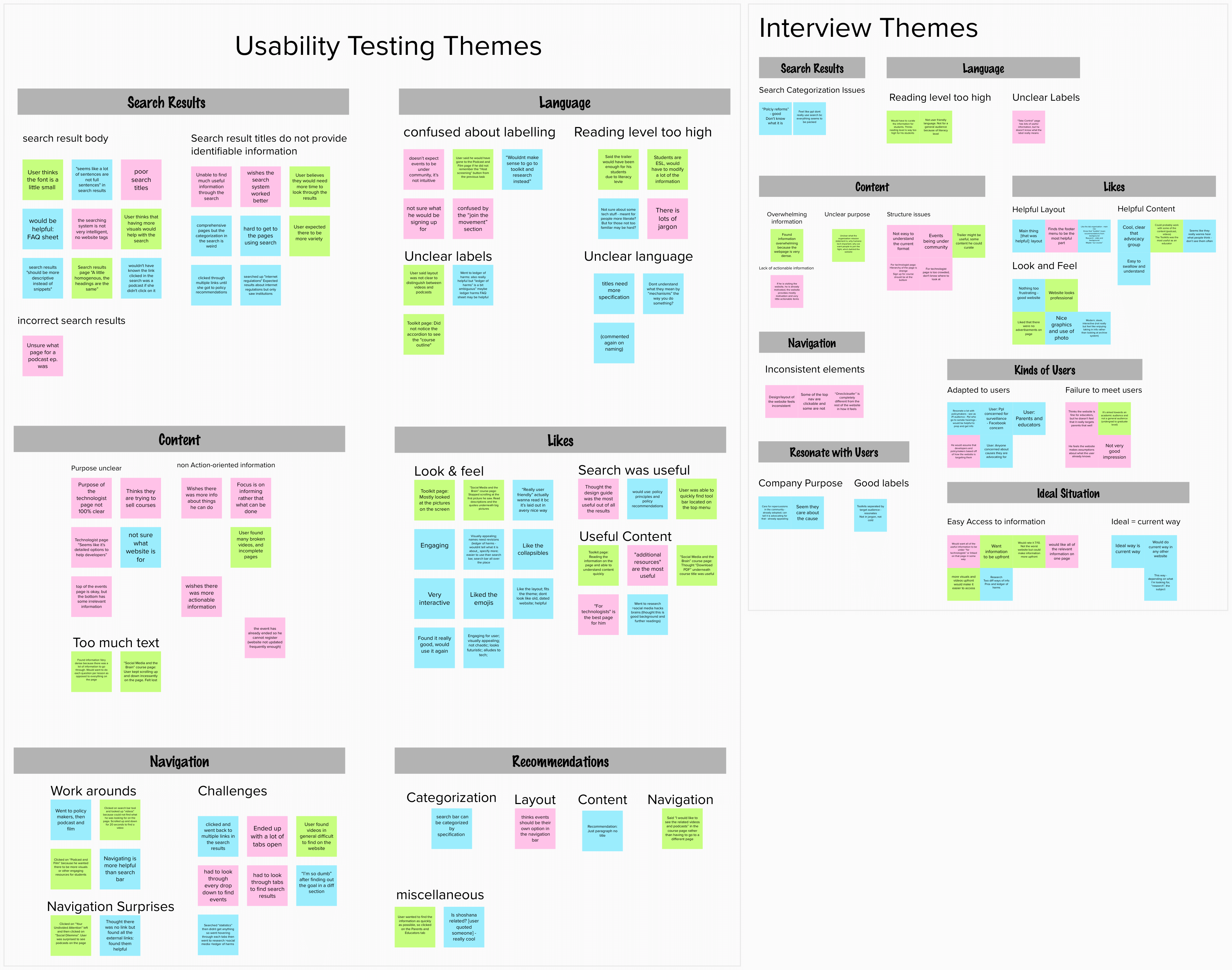
Emergent Themes
VALUABLE CONTENT
All participants found the content to be useful and relevant. The “toolkits” section was especially appreciated for separating resources by profession.
LABELING ISSUES
It was hard for the participants to go through the search results because the titles were not descriptive.
NAVIGATION ISSUES
Participants had to resort to trial and error to find relevant information. They found categorizations in the navigation confusing and ambiguous. The technologist and policymaker often had to deviate from the desired pathway and were surprised by unexpected page contents and ended up with multiple open tabs.
CONTENT AND LANGUAGE ISSUES
All participants found the reading level for content geared towards the general public to be too high for an average reader.
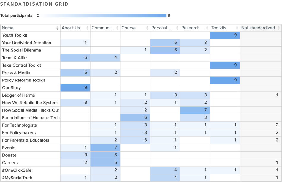
Card Sort Study
We wanted to understand the user’s existing knowledge structure and its mismatch with the existing top-down navigation of the website.
PARTICIPANTS
6 new and 3 previous participants. The new participants were students from our program who were not previously familiar with CHT or their website.
SETUP AND CARDS
Hybrid card sort study. The preexisting categories were simply the primary navigation links and secondary links as cards. We decided to introduce a new card “Foundation of Humane Technology” under the “Course” category because on the website “Course” serves as a direct link and may observe growth as CHT adds more courses.
EXECUTION
New participants were given a brief introduction to the organization. The participants were asked to think aloud during the activity and were asked related follow-up questions.
Card Sort Findings
We cross-referenced and analyzed the card sort results through the similarity matrix, standardization grid, and individual responses. We also created an affinity diagram to analyze attitudinal data gathered through think-aloud and post-task interviews.
TITLES WITHOUT CONTEXT
Many participants found certain labels like “How Social Media Hacks Your Brain”, “Your Undivided Attention”, “The Social Dilemma” to be non-descriptive of their content without context. These cards were sorted under multiple categories like “Courses”, “Research” or “Podcast & Film”, or even “Toolkits”.
NICHE AND AMBIGUOUS USE OF LANGUAGE
All participants found that labels such as “Ledger of Harms” were vague and ambiguous. Labels with hashtags were grouped under “Podcast and Film” because they felt it was closest to social media. Participants were able to sort cards with “toolkits” correctly but they did not understand what it meant.
DISTINGUISHING CATEGORIES
Participants faced difficulty distinguishing “Community” and “About Us”. “Community” could have been related to the organization or the public.
METHODS OF CATEGORISATION
Eventually, participants had to rely on grouping cards based on common and similar words, and then use elimination to group ambiguous cards.
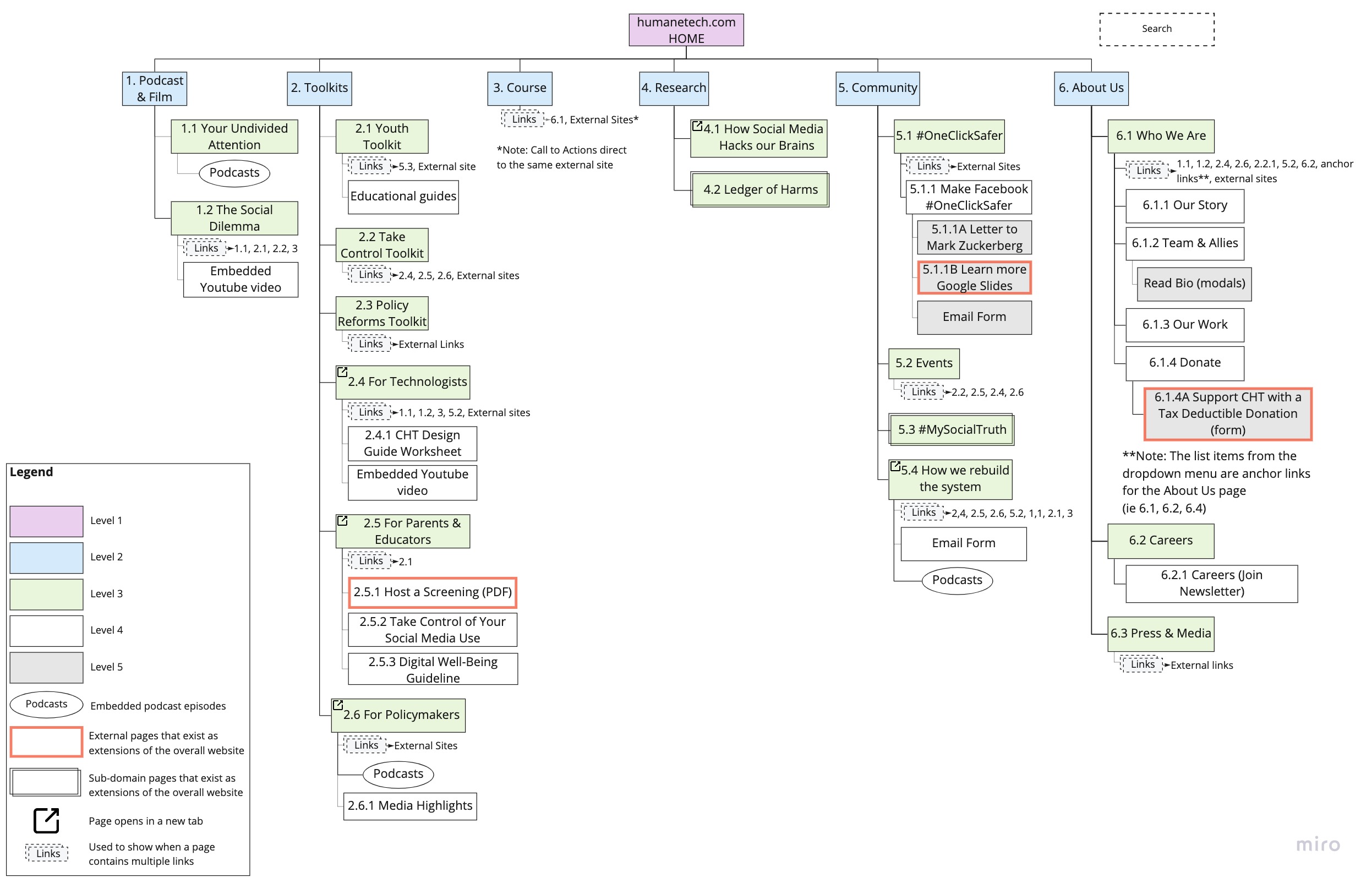
Current Information Architecture
NAVIGATION
The current IA accommodates the known-item information seeking model whereas our studies showed that users exhibit an exploratory seeking behavior. Users typically need a buy-in before they choose to dedicate more time to seeking information, therefore, a sense of direction is essential.
SCHEMATIC DIAGRAM
The following issues were identified:
- Excessively deep structure (5 levels)
- Depth imbalance due to weak top-level headings
- Tendency to compensate for weak information scent by using multiple cross-links
- Footer was never used to navigate
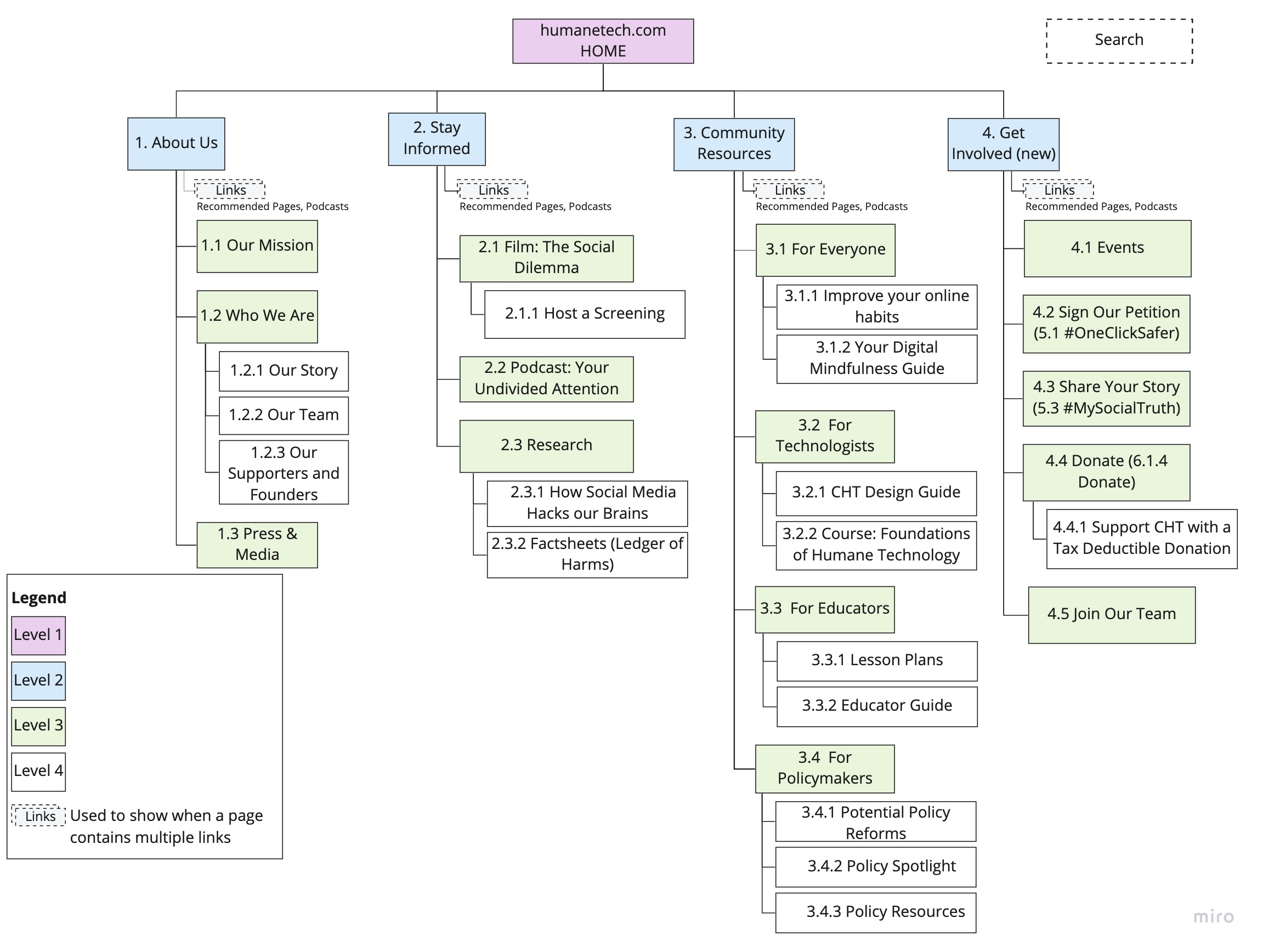
Redesigned IA Schema
The new proposed scheme aligns with the user's information seeking behavior.
ABOUT US
Provides context for why users should care about the website.
STAY INFORMED
Includes informative media like film, podcasts, course and research. We also changed labels to add context for its content. The new “Research” secondary link allows users to gather initial information before diving deep into specific publications.
COMMUNITY RESOURCES
Similar to toolkits with an added category “For Everyone” for general resources. We removed “...Toolkits” pages for consistency. Users will be able to access the content under their respective category.
GET INVOLVED
Contains ways to get involved with the organization. Hashtags were relabelled to “Sign our Petition” and “Share your Story” which are more representative.
SCHEMATIC DIAGRAM
The following issues were identified:
- Smaller in-depth and breadth (4x5 compared to 6x6)
- Action-oriented rather than item-oriented
- Links open up in the correct tab and domain
- Simplified footer now contains contact information, social media, careers and newsletter sign-up prompt
Visualising Flows
We created sequential storyboards for three defined and diverse flows. Each team member took an independent approach to the redesign for this iteration.
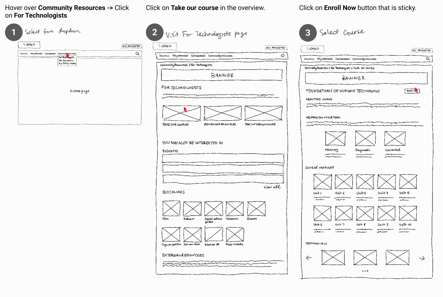
FLOW 1: SIGNING UP FOR A COURSE
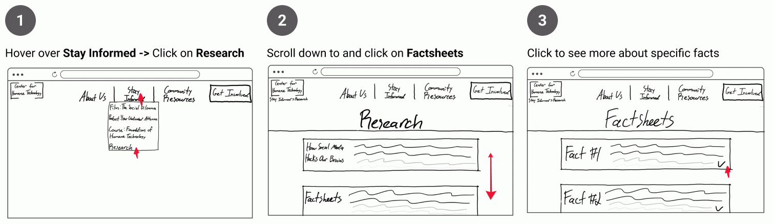
FLOW 2: GETTING TO THE “LEDGER OF HARMS” PAGE
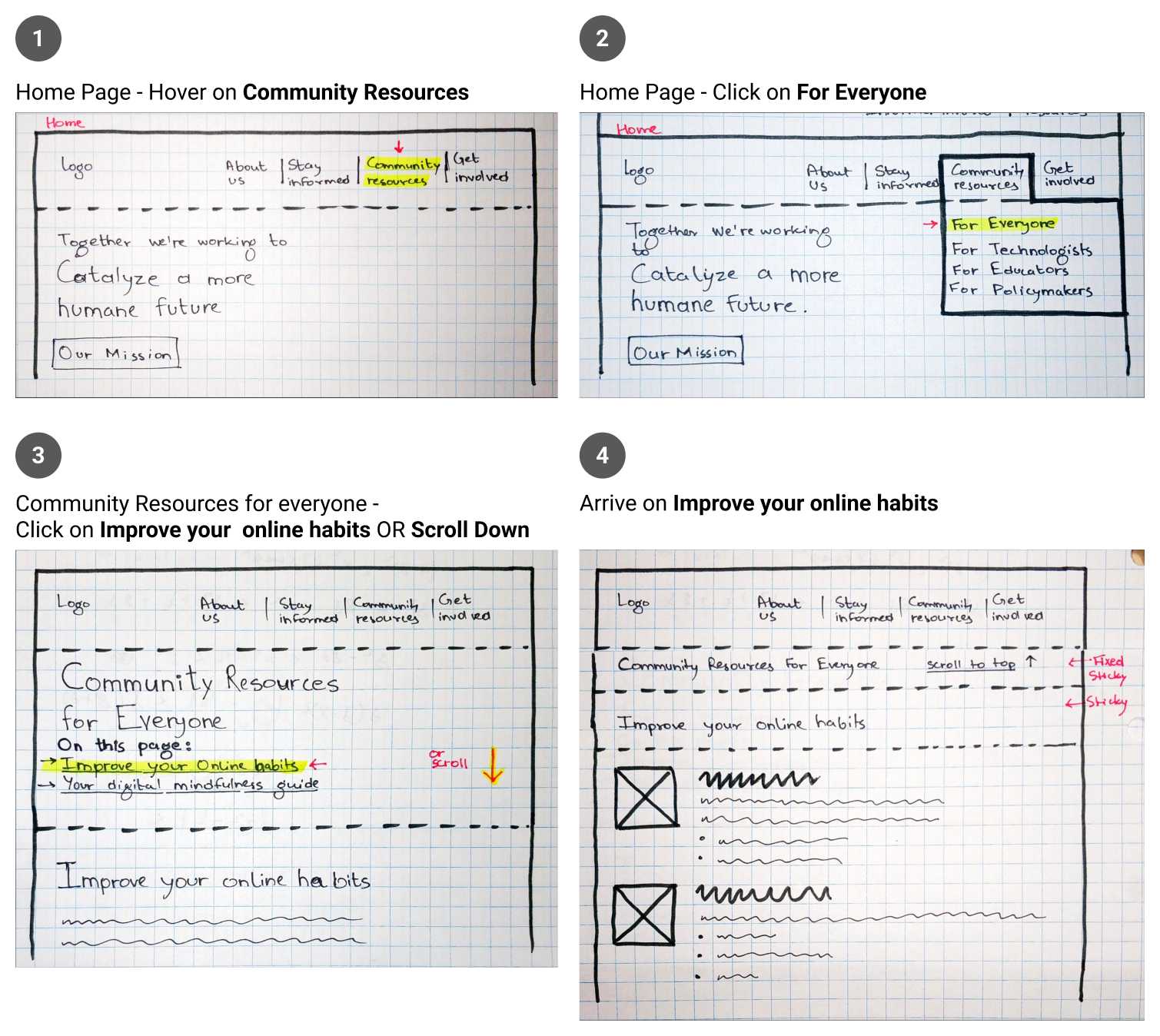
FLOW 3: GETTING TO TAKE CONTROL TOOLKIT PAGE
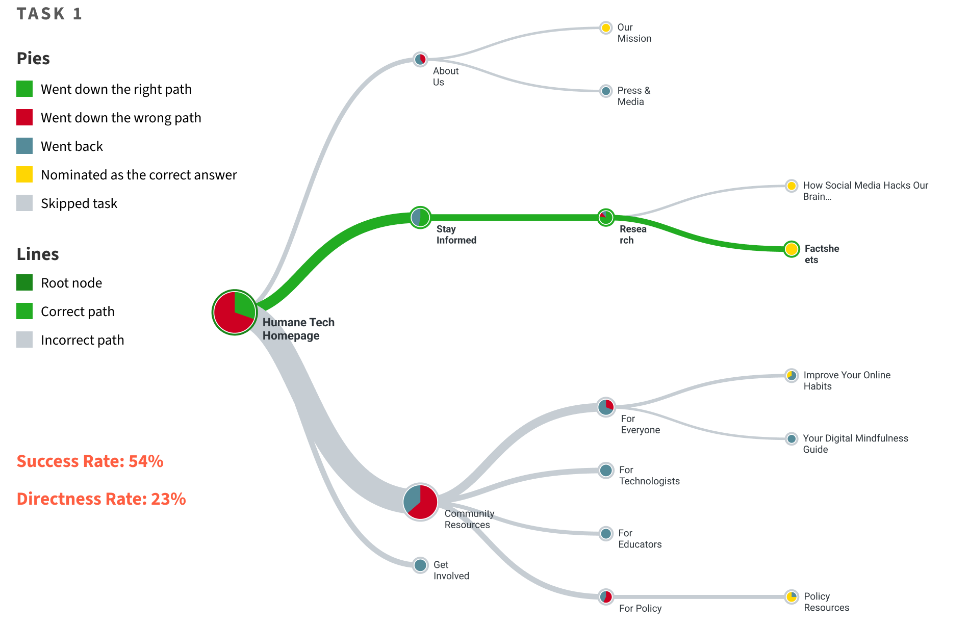
Tree Test Study
13 Participants completed 5 tasks each following the think-aloud protocol. We asked follow up questions pertaining to their experience.
TASK 1
Locate the page where you would expect to find statistics and links to external resources.
TASK 2
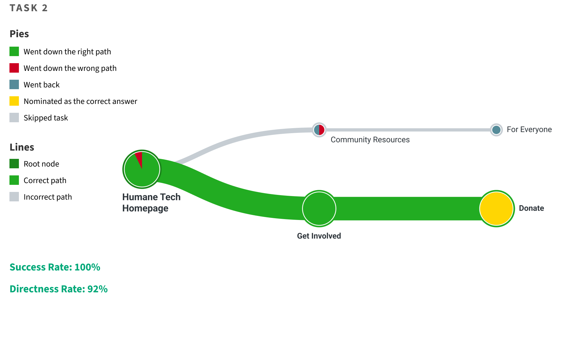
Locate the page where you would expect to find the option to financially support the organization.
TASK 3
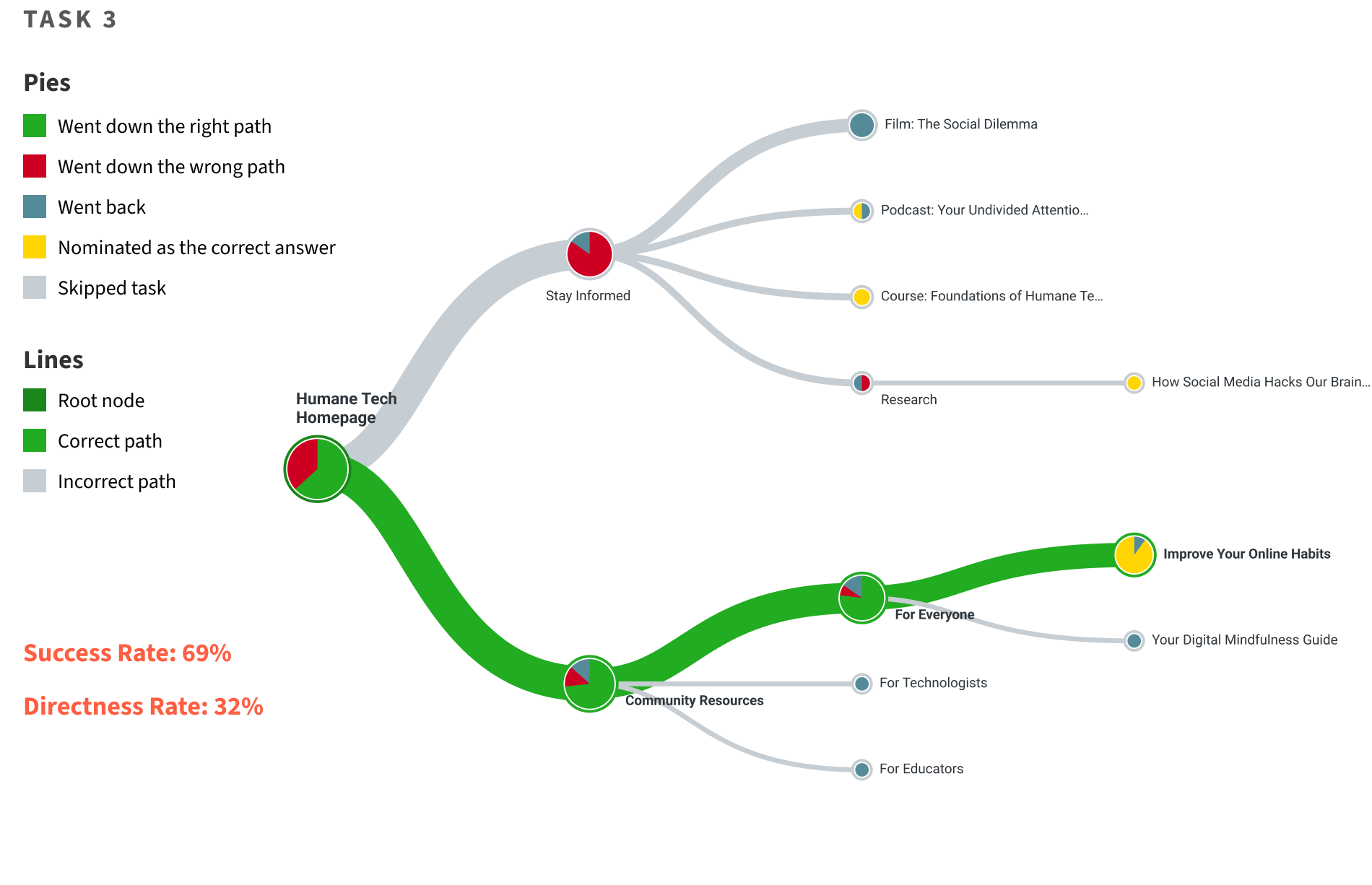
Locate the page where you would expect to find tips for taking control of and managing your social media usage.
TASK 4
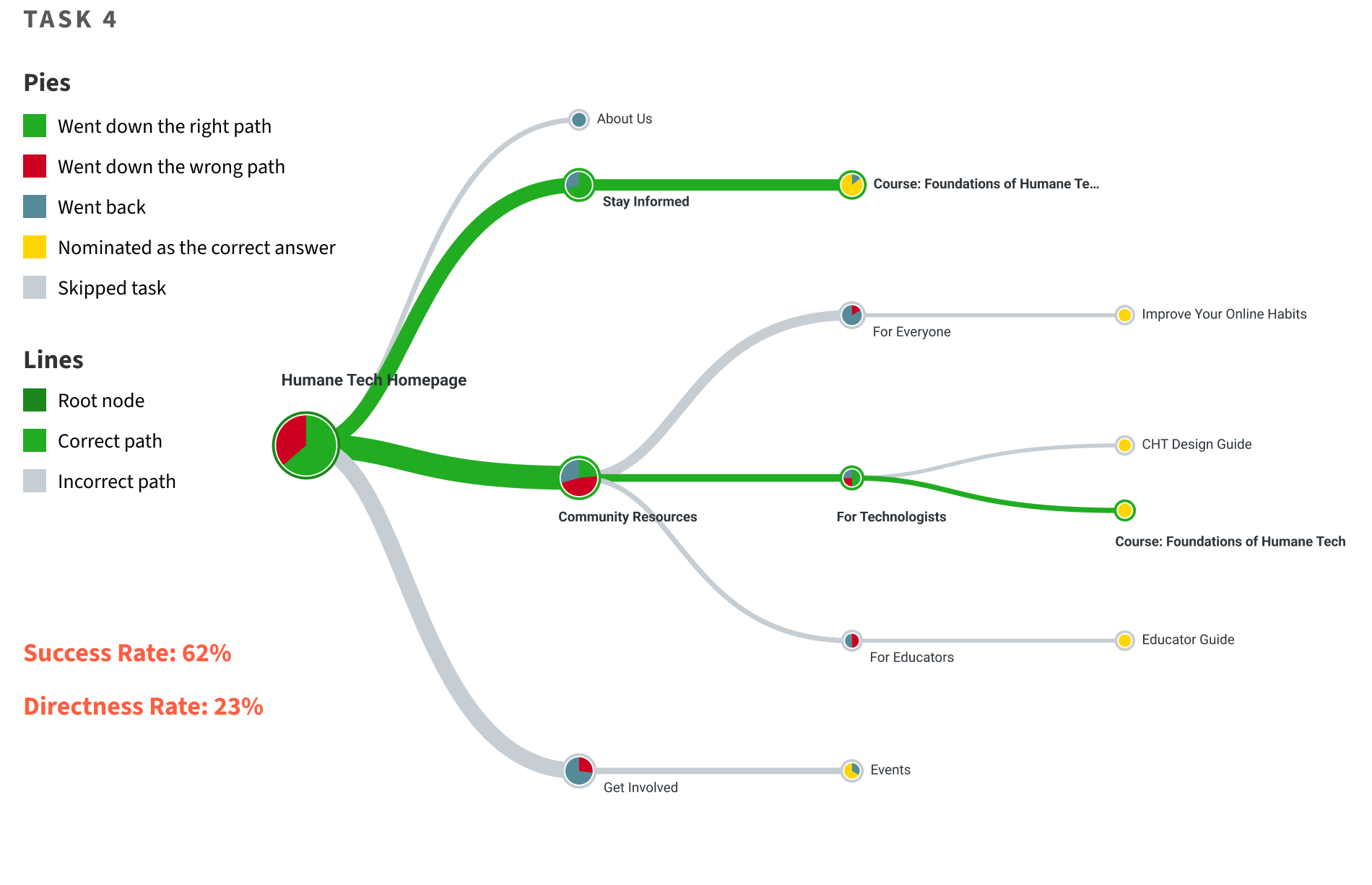
As a designer, locate the page where you would expect to be able to enrol in a class.
TASK 5
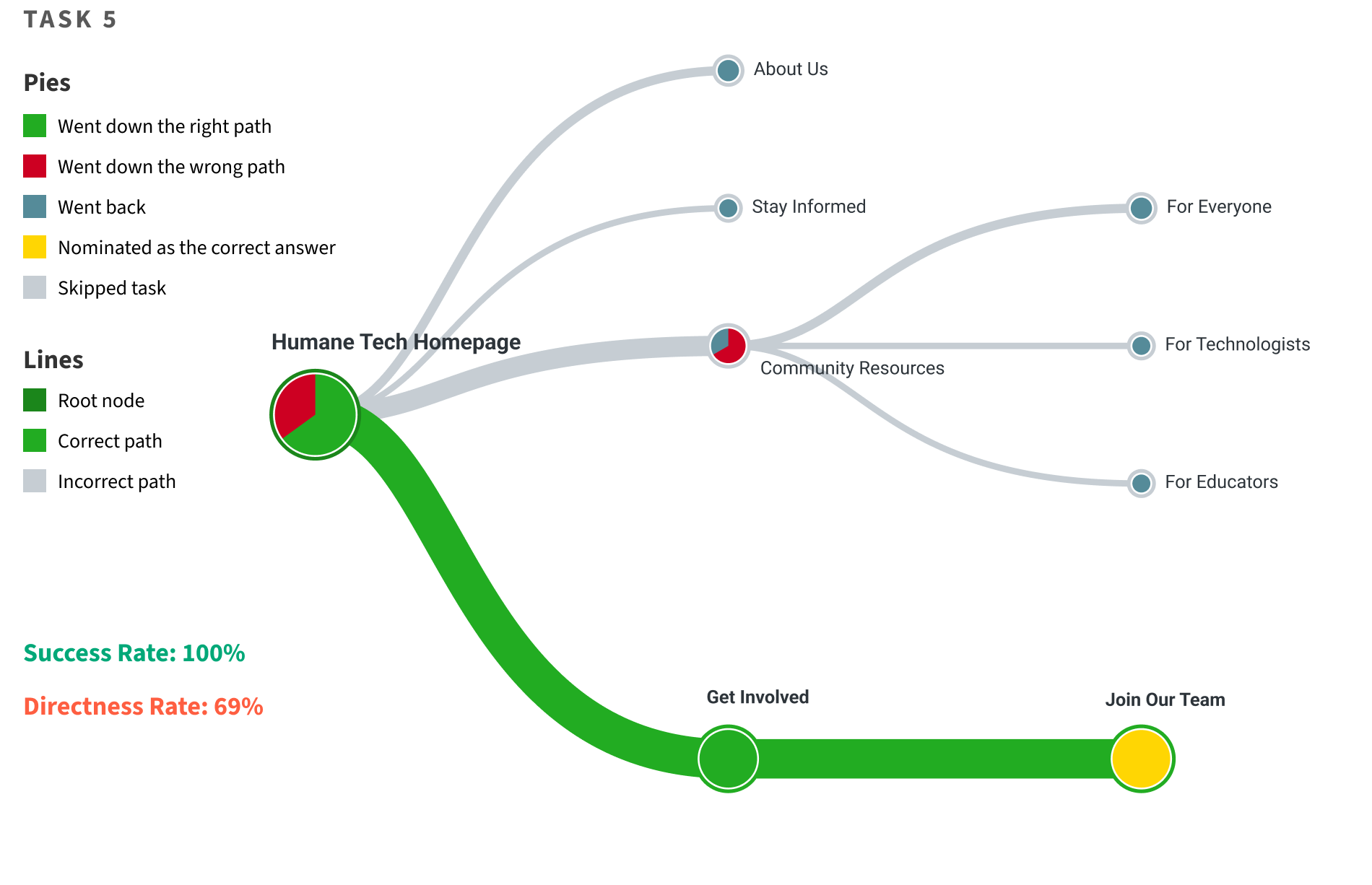
Locate the page where you would expect to find job postings.
SUGGESTED CHANGES
- Combine “Take Control of Your Social Media Use” and “Digital Well-being Guide” under a new heading “Digital Well-being guides” as a subcategory of “Stay Informed” since their content applies to a wider audience. “For Everyone” will be removed from "Community Resources" due to redundancy.
- Relabel "Community Resources" to "For Professionals" to differentiate it from "Stay Informed". Remove "For" from links under this category.
- Relabel “Research” to “Understanding the Problem” to better represent the content under this heading and make it more approachable since it directly relates to spreading awareness about the issue.
- Relabel “Factsheets” was to “Stats & Facts” to make it more approachable and descriptive.
Additional Changes
LANGUAGE
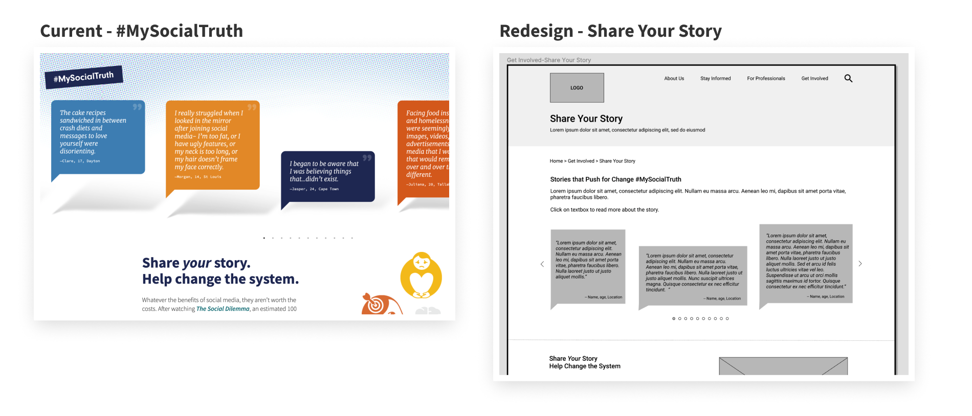
User’s found it difficult to understand titles such as “#MySocialTruth” without context. We changed it to “Share Your Story” to better convey its purpose.
ESTABLISHING CONSISTENCY
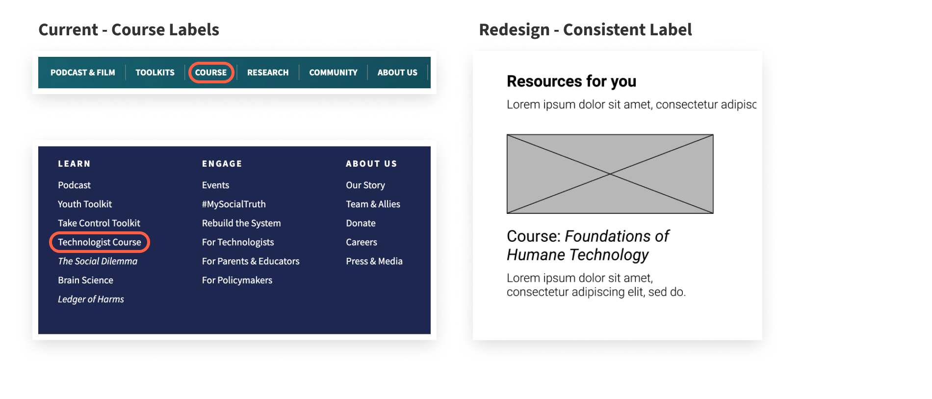
The current website uses multiple labels such as “Course”, “Technologist Course” for their course offering. This is inconsistent and non-descriptive. We decided to add the course’s name “Foundations of Humane Technology” to the label and moved it under “For professionals" > "Technologist”.
NAVIGATION
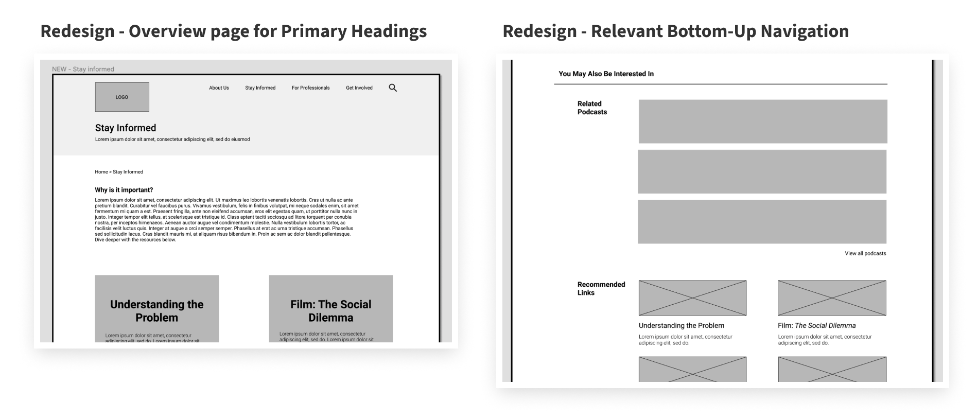
We decided to add an overview page for each primary navigation heading to establish context and help first-time users navigate through the website.
IMPROVING FINDABILITY
CHT currently embeds an extensive amount of hypertext into each page, disrupting the information hierarchy of the website. Oftentimes, there are even multiple hypertext and links on the page that lead to the same destination. Lack of breadcrumbs makes navigating backwards a trial-and-error task, and as seen during usability studies, users find the current search system to be ineffective.
We suggest a section at the bottom of each page that provides relevant and related information. We also added breadcrumbs to our prototype.
Mid-Fi Prototype
Check out all our proposed changes in action through this clickable medium fidelity prototype.
View Prototype
Learnings
ADOPT THE USER'S MENTAL MODEL
Users may already be familiar with the purpose and content of the website, or they might mostly be first time users looking for information. This knowledge about the user's information seeking behaviour is crucial in designing intuitive IA for a platform.
STAKEHOLDERS
Users are not the only stakeholders for a website, the owners also have important preferences for the content and message they want to convey to the users. It is essential for the IA to support these preferences.